permata hutan yang indah || Ubud, Bali
permata hutan yang indah || Ubud, Bali ⠀
⠀
Secret forest gem

⠀
Secret forest gem
kebahagiaan putih I || Ubud, Bali
kebahagiaan putih I || Ubud, Bali ⠀
⠀
Elegant, exotic, blissful white goddess ⠀
⠀

⠀
Elegant, exotic, blissful white goddess ⠀
⠀
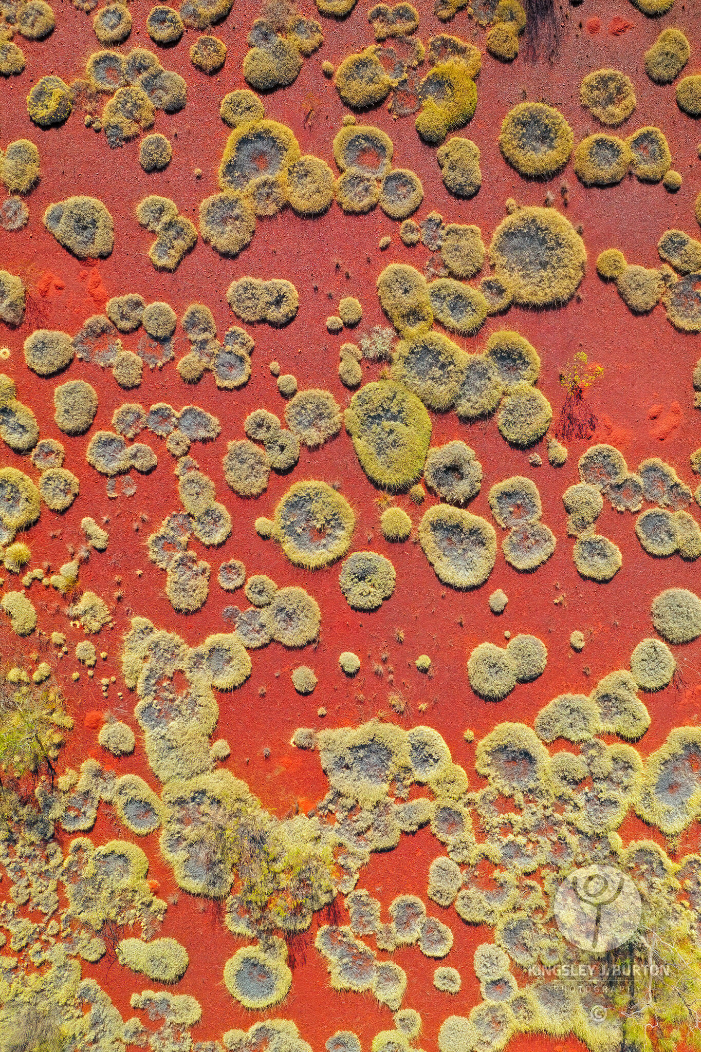
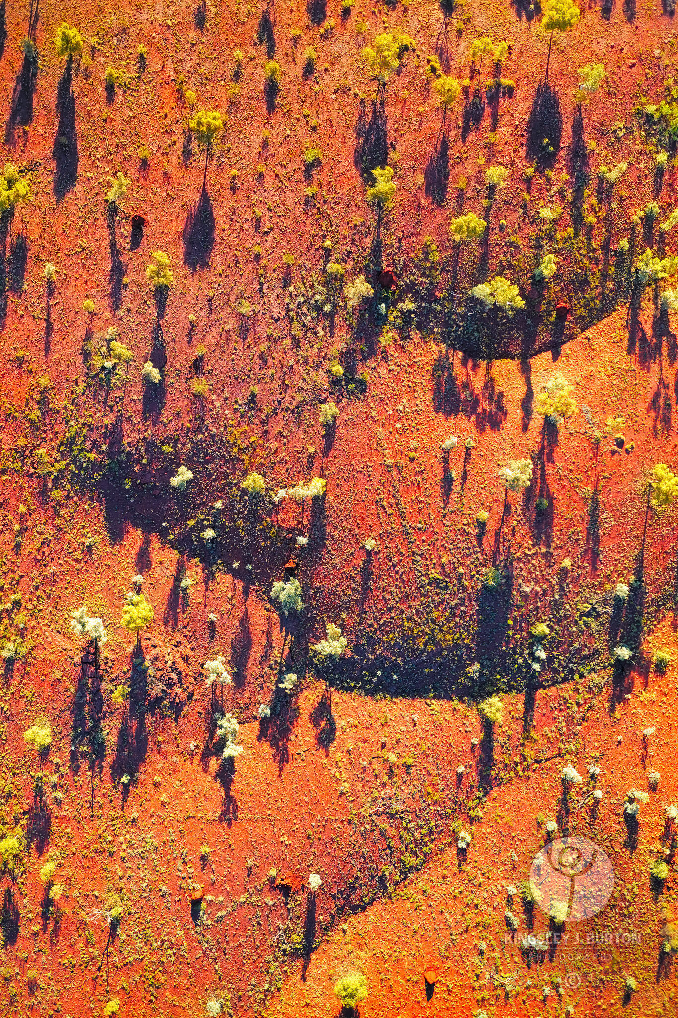
Chaos + Colour = Elegance
Recently I was out and about with Albert, who I have yet introduced my blog readers to yet... but I digress... out and about with Albert walking through the park at the back of our property and I came across this scene. What I saw was something beautiful, elegant and sophisticated. I don't think I could have crafted this even if I had spent days constructing it, and yes I have tried, and no you're not going to see the outcome of that!
So to the image, something beautiful, colourful, elegant and the epitome of chaos theory... in chaos there is order. From the randomness of the trees dropping their leaves and flowers and the wind and rain combining them into this form. It is beautiful. Enjoy.
So to the image, something beautiful, colourful, elegant and the epitome of chaos theory... in chaos there is order. From the randomness of the trees dropping their leaves and flowers and the wind and rain combining them into this form. It is beautiful. Enjoy.
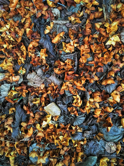 |
| Autumn Beauty 2016 |
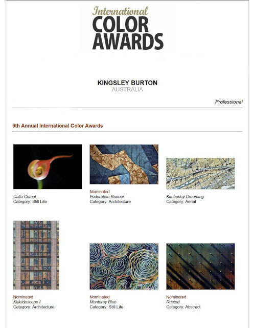
Awarded Nominee in 9th Annual International Color Awards
FOR IMMEDIATE RELEASE:
9TH ANNUAL INTERNATIONAL COLOR AWARDS HONORS PHOTOGRAPHER KINGSLEY J. BURTON FROM WESTERN AUSTRALIA
LOS ANGELES - Australian Institute of Professional Photography Accredited Professional photographer Kingsley J. Burton of Western Australia was presented with the 9th Annual International Color Awards Nominee title in the categories of Architecture, Still Life and Abstract at a prestigious Nomination & Winners Photoshow streamed Saturday, March 26, 2016.
The live online gala was attended by over 10,000 photography fans around the globe who logged on to watch the climax of the industry's most important event for color photography.
The international Jury included captains of the industry from Contrasto, Rome; National Gallery of Victoria, Melbourne; Whitechapel Gallery, London; DDB, Berlin; Forsman & Bodenfors, Gothenburg; Art Beatus Hong Kong; DB Agency, Milan; InStyle Magazine, New York and Kunst Haus Wien, Vienna who honored Color Masters with 591 coveted title awards and 634 nominees in 33 categories.
Top honors for Photographer of the Year went to:
Professional:
1st Place - ANTONIO MASIELLO - Italy
2nd Place - SIMON EELES - USA
3rd Place - VICTORIA PARNALL-VAUGHAN - UK
Amateur:
1st Place - DANIEL FEHR - Switzerland
2nd Place - SUSAN JACOBS - USA
3rd Place - LINC GASKING - New Zealand
Professional:
1st Place - ANTONIO MASIELLO - Italy
2nd Place - SIMON EELES - USA
3rd Place - VICTORIA PARNALL-VAUGHAN - UK
Amateur:
1st Place - DANIEL FEHR - Switzerland
2nd Place - SUSAN JACOBS - USA
3rd Place - LINC GASKING - New Zealand
"It is an incredible achievement to be selected among the best from the 5,678 entries we received this year," said Basil O'Brien, the awards Creative Director.
Kingsley's "Federation Colour” and “Kaleidoscope I" in the Architecture category, “Monterey Blue” entered in the Still Life category and “Rusted” into the Abstract category, are exceptional images and represent contemporary color photography at its finest, and we're pleased to present him with the title of Nominee."
"The variety of entries was astonishing," said juror Lilli Langenheim, Senior Art Director of DDB Berlin. "Some of the work is truly powerful; Fine Art, Sport, Nature in professional was really inspiring and the Wildlife category in amateur was one of the most exciting," added jury member Daria Bonera, Owner of DB Agency in Milan.
INTERNATIONAL COLOR AWARDS is the leading international award honoring excellence in color photography. This celebrated event shines a spotlight on the best professional and amateur photographers worldwide and honors the finest images with the highest achievements in color photography. www.colorawards.com
# # #
Contact: Kingsley J. Burton
Telephone: +61 413 621 520
Email: kingsley@kingsleyjburton.com
Website: http://kingsleyjburton.com
Telephone: +61 413 621 520
Email: kingsley@kingsleyjburton.com
Website: http://kingsleyjburton.com
City Series III: Ocean Steel
A bit of a hiatus between my last post and now... things have been a little busy over this part of the world. Anyway, to start the next season of images I have to start, some of City Series III: Ocean Steel.
City Series III: Rainbow
Hi all,
I've been a tad busy over the lst couple of weeks and am a bit off my routine posting schedule, but I should be slowly coming back up to full speed. To start the week right, an image from City Series III - Rainbow.
I've been a tad busy over the lst couple of weeks and am a bit off my routine posting schedule, but I should be slowly coming back up to full speed. To start the week right, an image from City Series III - Rainbow.
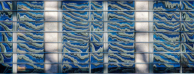
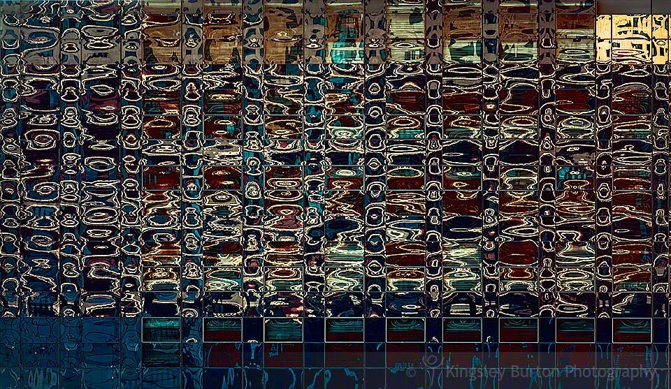
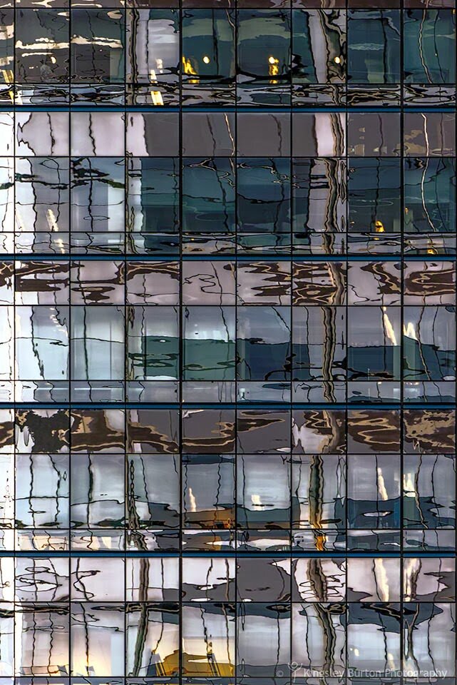
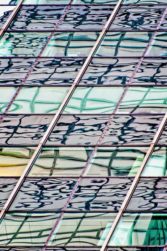
City Series II || Opal Mosaic
This photograph intrigues me. The combination of colour, intensity and form reminds me of the combination of blueish Opals, and mosaic tiles. I'm very intrigued as to whether you like this one or not. Interestingly I haven't been able to pick 100% what you, my friends, like in this series, and by that I mean how many people stop,view and like it.
I love the high degree of complexity in this images, that demonstrate both a high degree of order, as well as chaotic organic-like forms.
I dont often talk about what I see or what captured me to talk the photograph but this time I wanted to let you know what I saw or rather what intrigued me. The first thing that I noticed was the highly structured black window frames contrasted by the horizon light blue/purple windows. Next I loved both the complex reflection pattern that looked in some panes as highly structured and regular next to organic like curved reflections, with different strips of horizontal colour.
For me, I seek or rather experience photographs or get drawn to them, often I'm not sure why, its more an intuition or feeling I get about them.
Anyways enough prattling. I hope you like this image. Enjoy.
City Series II || Crisp Colour Pane
Todays post is something a little different in the City Series. Whilst the subject matter is the same, I have 'developed' this image slightly differently. You may not be aware but I am very drawn to colour in my images... yeah, ok, so thats not a big secret... but this image is awesome because of the vigour, liveliness and vitality with out being over saturated. Beautiful and complimentary tones of graphical and architectural forms. Enjoy.
City Series II || Ruby Dreams
Strong, passionate and potent. Look into the eyes of Ruby Dreams.
Enjoy.

Enjoy.
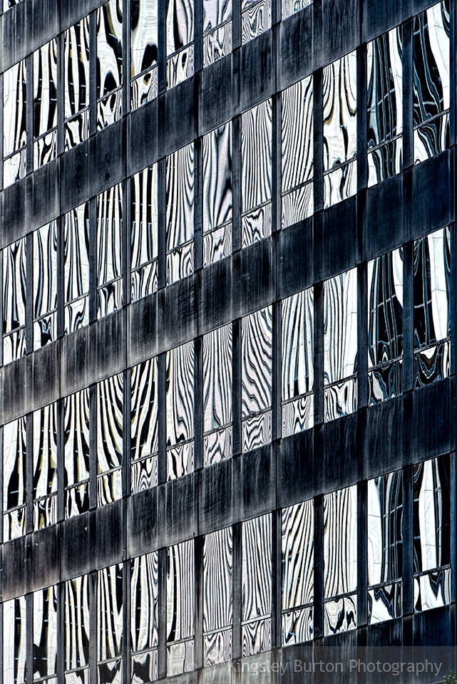
City Series II || Zebras in the city...
City Series II: Zebras in the city.
Something a little different this time, its actually a colour image, but it is black and white.
To see more of the City Series I and II, scroll down or have a peek over here... http://bit.ly/WDxpfi
Something a little different this time, its actually a colour image, but it is black and white.
To see more of the City Series I and II, scroll down or have a peek over here... http://bit.ly/WDxpfi
City Series II || Bold Beige Boxes
I missed out on Tuesday's post. My apologies. However back on track.
This one is all blues, brown and beige. Something a little more geometrical than colourful.
Enjoy.
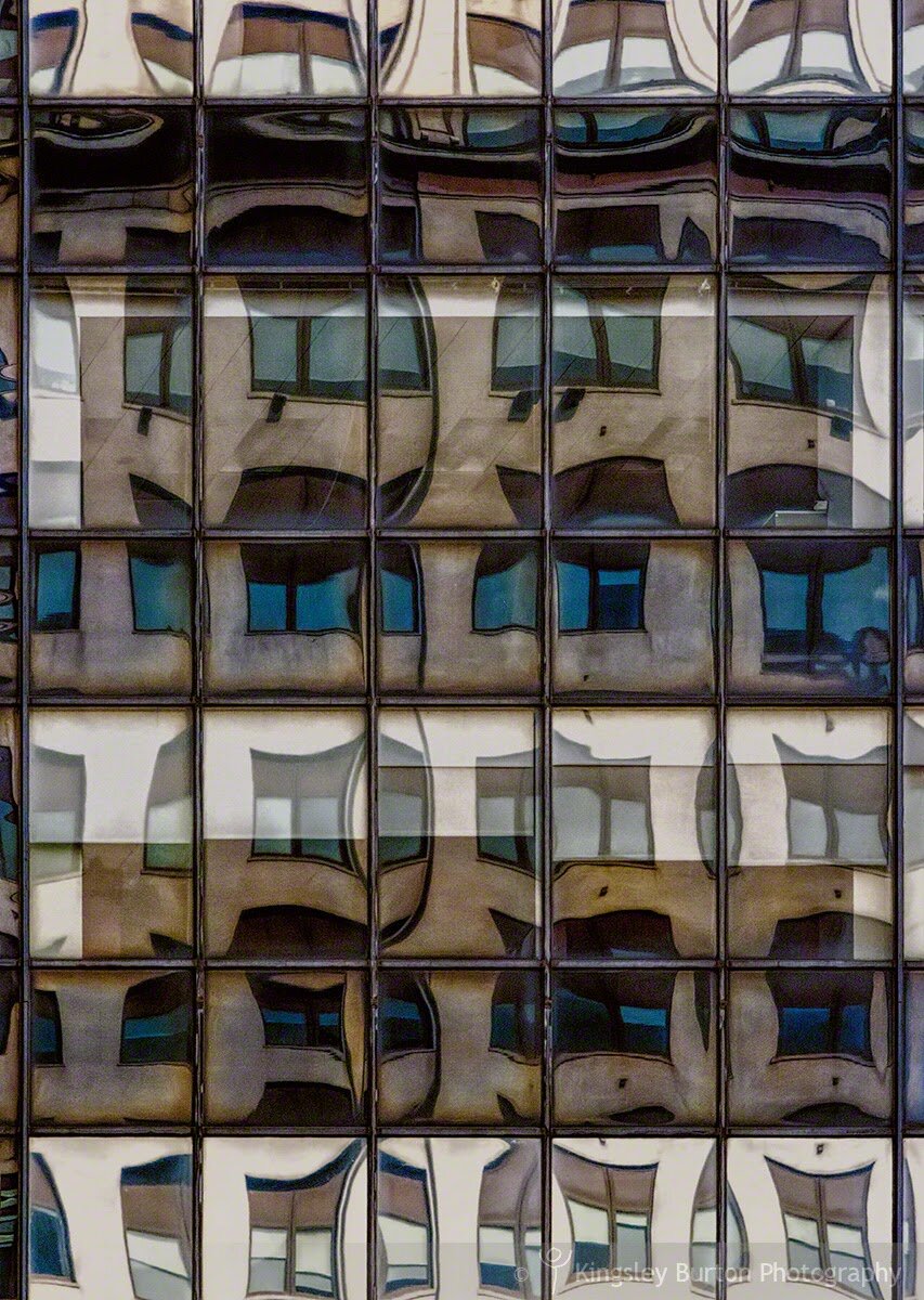
This one is all blues, brown and beige. Something a little more geometrical than colourful.
Enjoy.
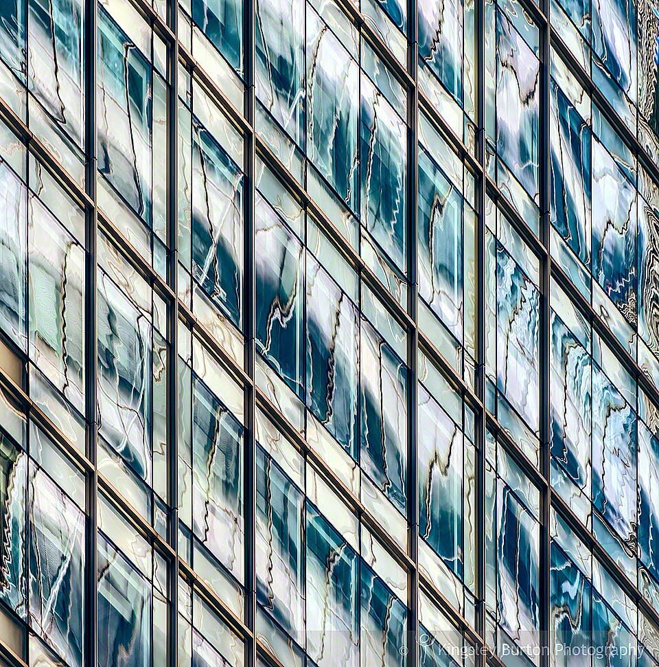
City Series II || Manhattan Arctic Views
Manhattan Arctic Views.
I love the 'freshness' of the colour and tones of this image.
The strong blues and whites and 'electrified' lines through the image.
Enjoy.
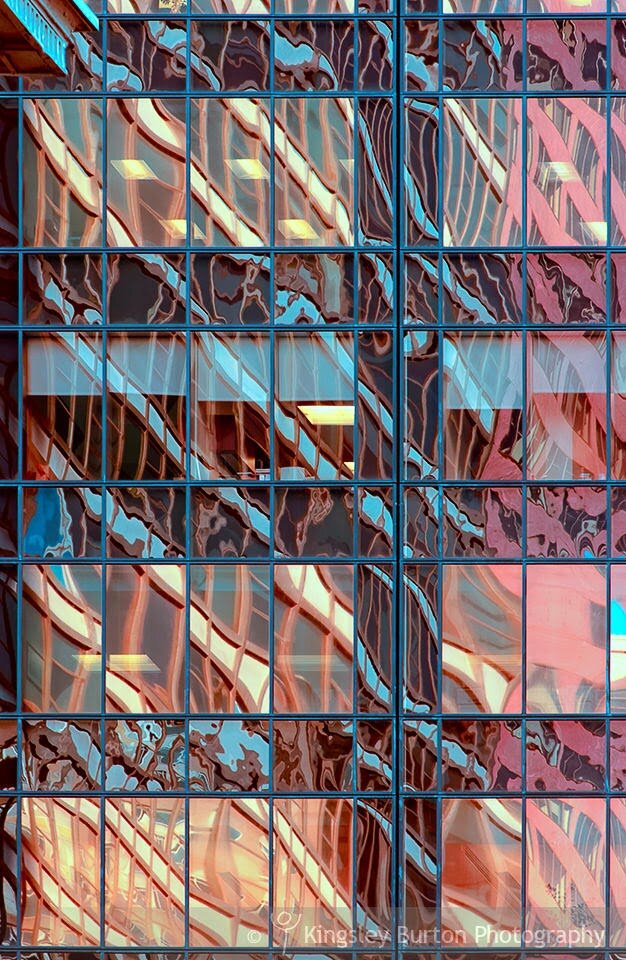
City Series II || Bronzed Dawn
As the sun rises over Manhattan, Bronzed Dawn unveils itself.
Full of life, colour and form.
Fleeting tempting views that disappear.
Glory formed unveiled Bronzed Dawn.
Enjoy.
Full of life, colour and form.
Fleeting tempting views that disappear.
Glory formed unveiled Bronzed Dawn.
Enjoy.
City Series II || Sunset Pool
This photograph has become one of my favourites from the City Series II.
I like the tones and colour that captures the setting light contrasted bu the clean and crisp greens and blues. A pool of slow moving water, with the hint of a change of the day on the way.
Enjoy. Sunset Pool.
I like the tones and colour that captures the setting light contrasted bu the clean and crisp greens and blues. A pool of slow moving water, with the hint of a change of the day on the way.
Enjoy. Sunset Pool.
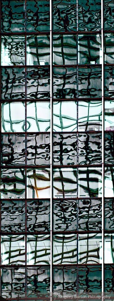
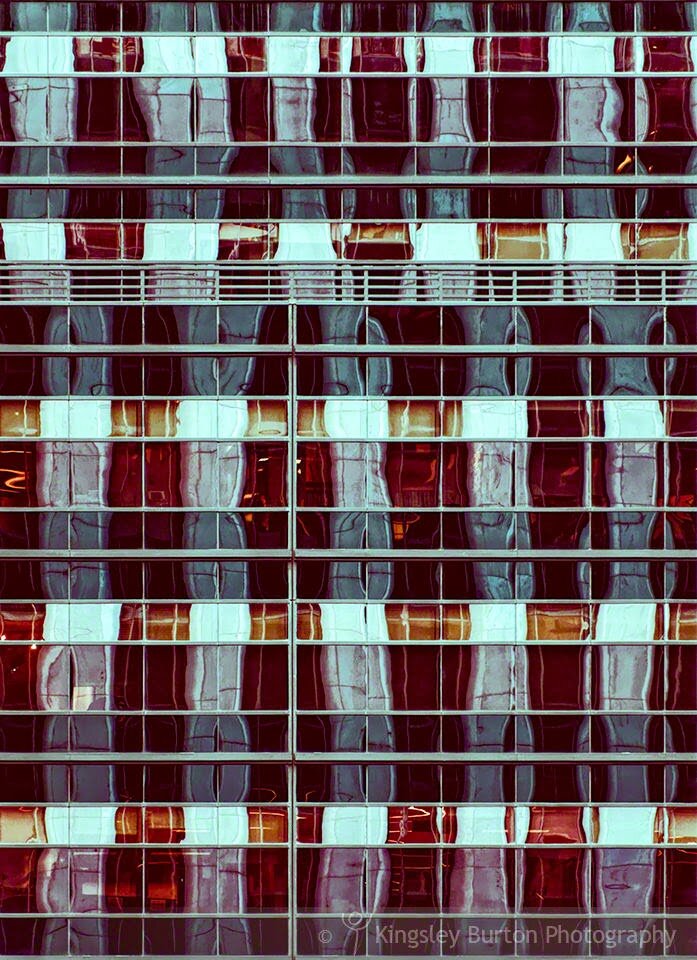
City Series II || Blue Hatches
A complex interplay of lines, colour and form.
I love the blue of the reflections with scattered cream lights showing from the inside of the building.
Just out of interest this shot was taken immediately before Korner Kalidescope. Just goes to show that a few steps one way can change the view and photograph radically.
I hope you enjoy Blue Hatches.
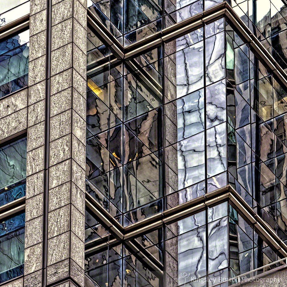
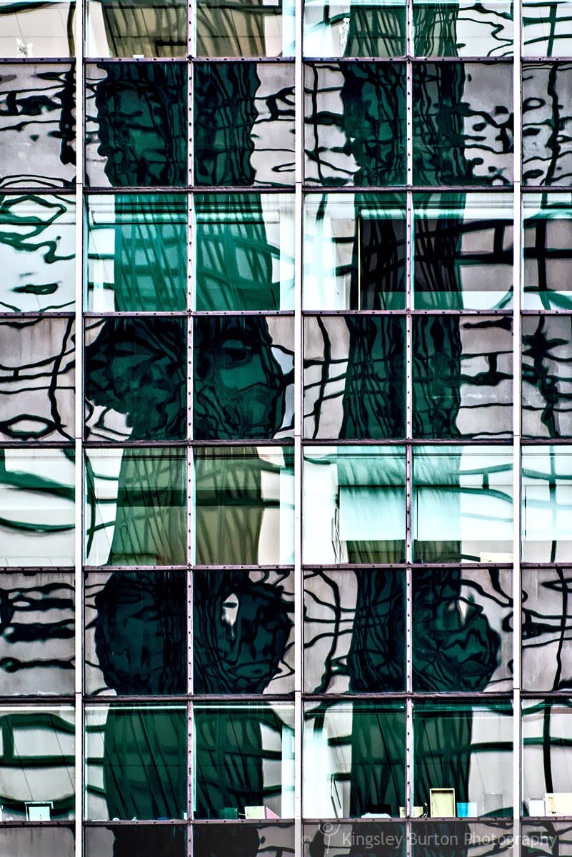
City Series II || Korner Kalidescope
Something a little abstract today.
The roughness of the stone work, contrasting the smooth slick surface of the glass... colours reflection tones and hues across multiple surfaces. Enjoy.
The roughness of the stone work, contrasting the smooth slick surface of the glass... colours reflection tones and hues across multiple surfaces. Enjoy.
City Series II || Green Water Tall
Tonight's image is one of my favourites from the new City Series II.
A strong image, full of verve in colour and form... a signature.
Photographed in Manhattan, New York in 2013.
Enjoy.
A strong image, full of verve in colour and form... a signature.
Photographed in Manhattan, New York in 2013.
Enjoy.
City Series II || Lavender Lanes
Glistening and glimmering,
Reflecting of the surface,
Lavender lanes,
Techno hydrospace.
Enjoy.
Reflecting of the surface,
Lavender lanes,
Techno hydrospace.
Enjoy.
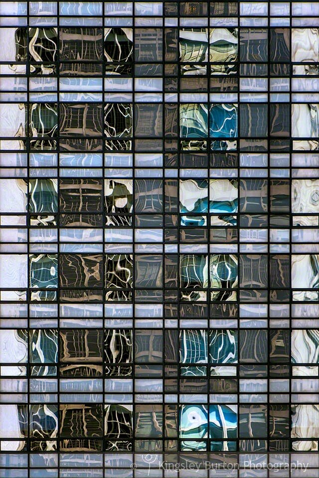
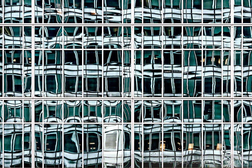
City Series II || Polar View
This commences the start of a new city series, City Series II.
Captured in Manhattan, New York, I love this image for the green and whites, with the dark hatching. It reminds me of a cold frosty winters day in Manhattan.
Polar View.
Enjoy.
Captured in Manhattan, New York, I love this image for the green and whites, with the dark hatching. It reminds me of a cold frosty winters day in Manhattan.
Polar View.
Enjoy.
City Series I || Cafe Mermaid
Swimming through the ocean,
Having a caffeine craving,
Getting chilly could be brazen,
Ahh, cafe goodness, a blessed haven.
Enjoy.
Having a caffeine craving,
Getting chilly could be brazen,
Ahh, cafe goodness, a blessed haven.
Enjoy.